A calm, tranquil home doesn’t have to rely on whites, beiges, or creams. If you’re drawn to spaces with depth and character, adding colour to a minimalist home can be both beautiful and
soothing. Here are six thoughtfully curated palettes that bring visual interest while still nurturing a sense of peace and balance.
We humans are evolved from nature. The first life was believed to be originated in water. That is why we crave for nature; we love certain kind of environment. That is why you must have felt happier and peace in certain natural setting like at lakes, beaches, mountains or parks. You can bring nature into your home with plants or natural elements, like wood, water and stone. But you can do so in less obvious ways, too like using natural color palette – white, cream, beige and grey, by artworks and earth tones. Minimalism and strong connection with nature give the
sense of clarity and focus.
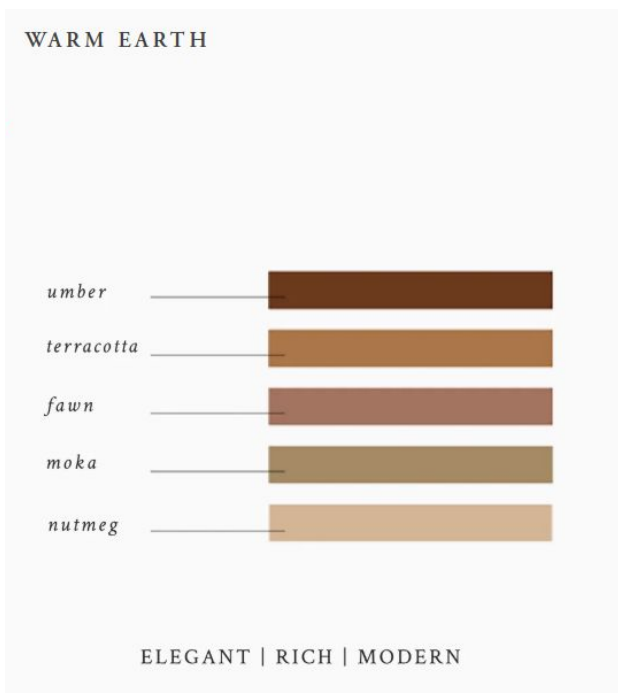
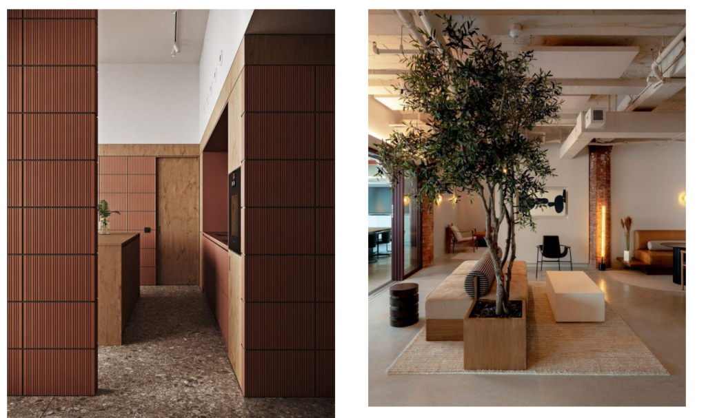
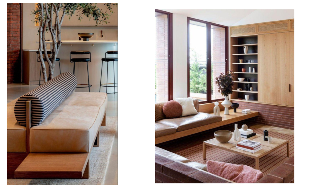
This palette combines earthy neutrals with
softened red and orange tones, evoking warmth,
energy, and a sense of wellbeing—traditionally
linked to good fortune in cultures like India and
China. The reds are toned down with texture and
creamy contrasts, while light browns and beiges
balance the heat, creating a space that feels both
grounding and uplifting.
How to use it:
With its red undertones, this palette works best in social spaces like the living room or kitchen. Use lighter shades for a brighter feel, or deeper
tones on walls and floors for a richer, cozier look. Enhance the warmth with tactile materials like exposed brick, terracotta tiles, and raw wood.
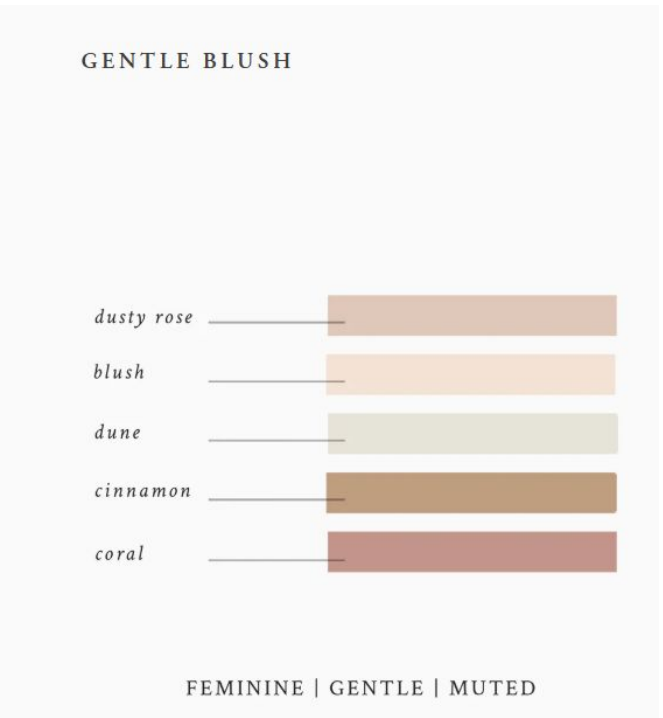
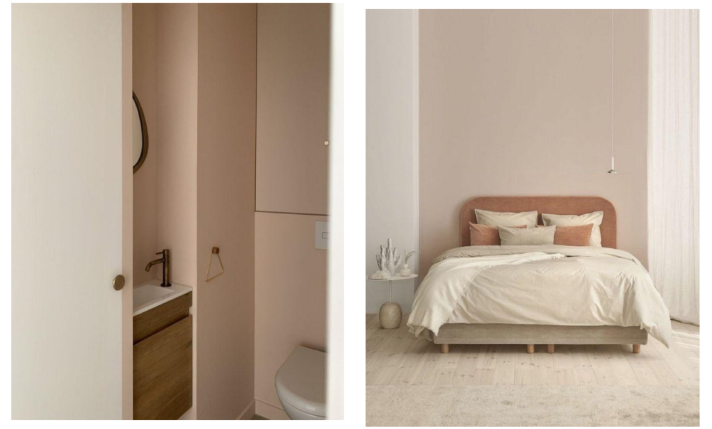
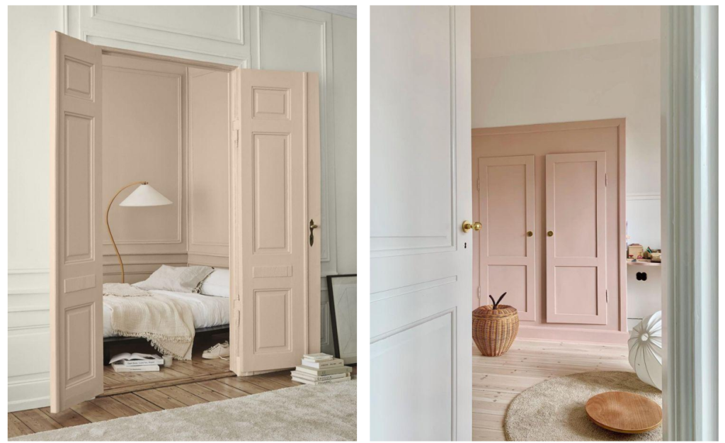
Pink, often associated with femininity in the Western world, has even been used in the
past to calm and soothe moods. This soft, dusty palette evokes kindness and
intimacy, with a gentle, comforting quality that makes it perfect for bedrooms and bathrooms.
How to use it:
Pair warm pinks with natural materials like rattan and wood to enhance their richness. For a cozy,
cocooning feel, paint an entire room in a soft pink—especially effective when adjacent spaces
remain white. If you prefer subtlety, start small with painted details like skirting boards, doors, or window frames.
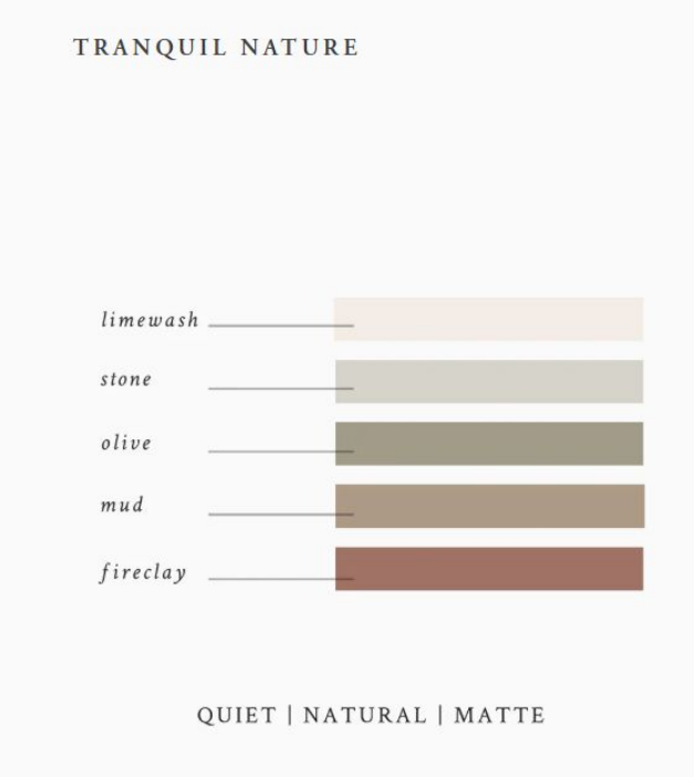
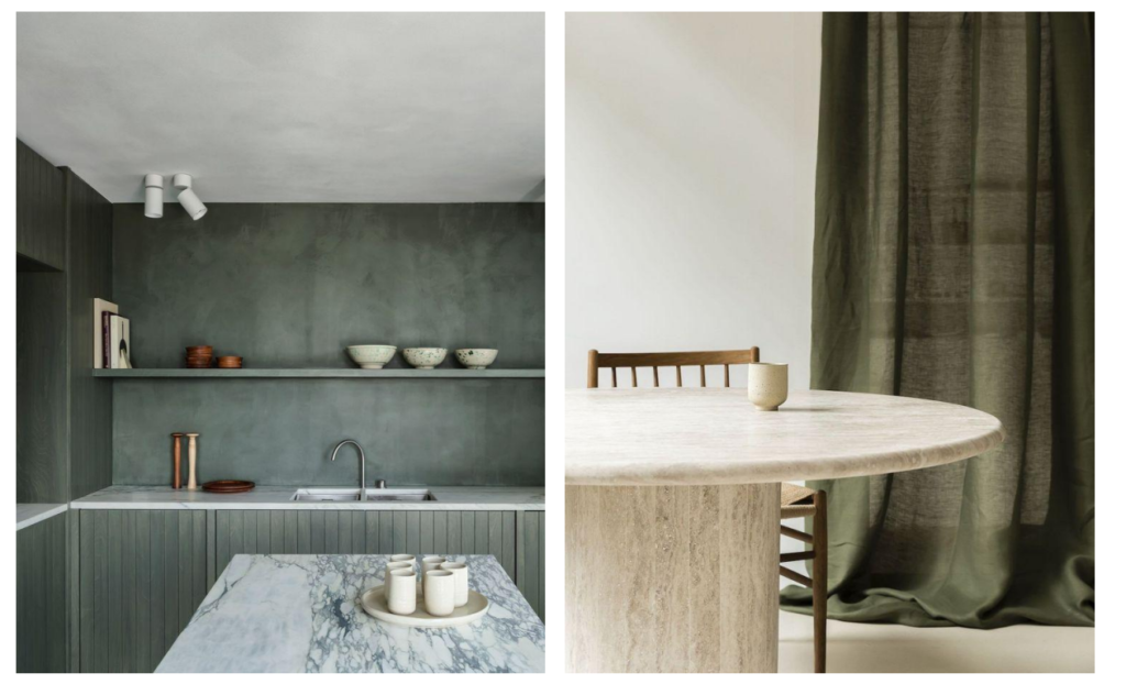
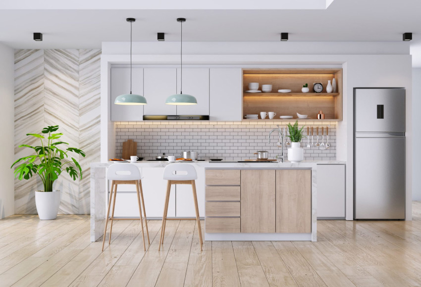
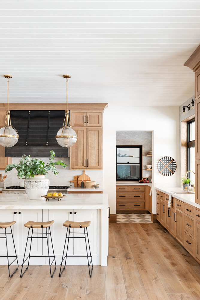
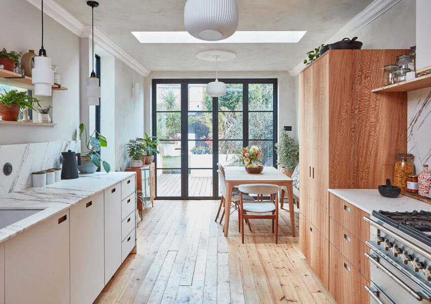
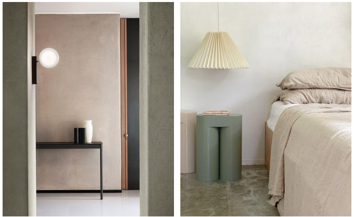
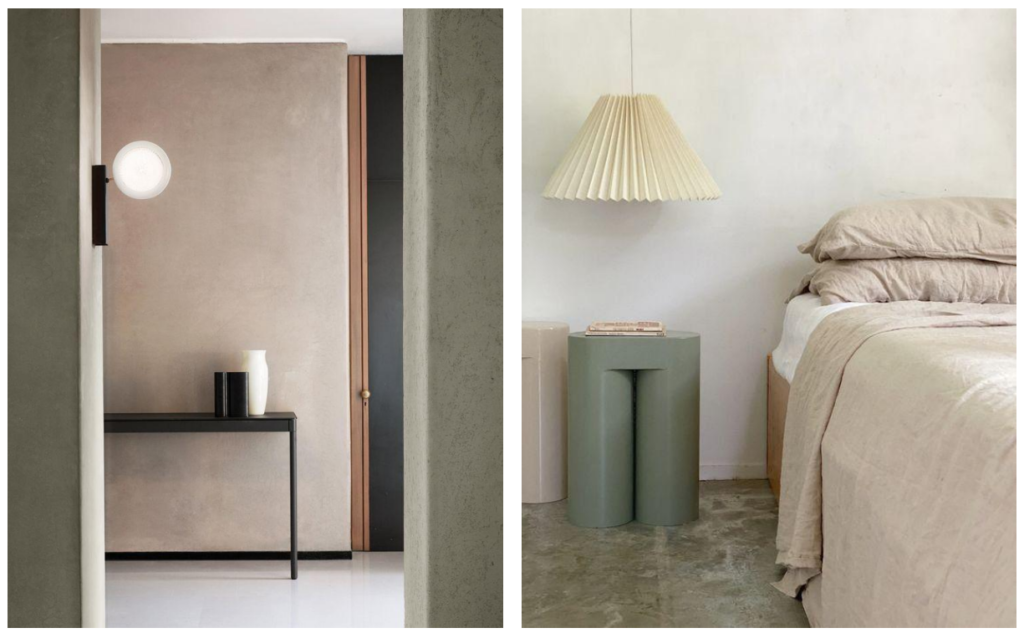
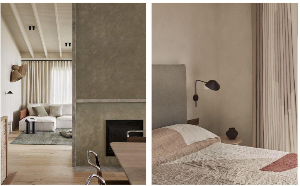
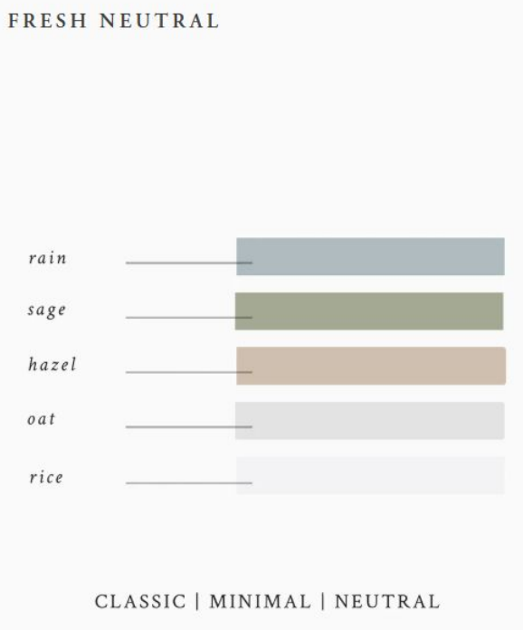
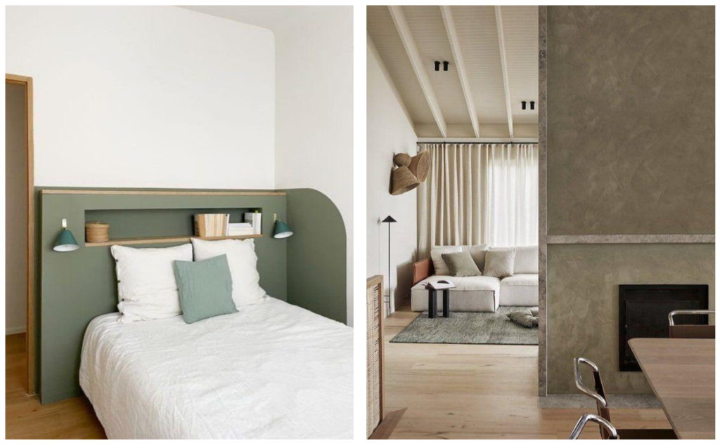
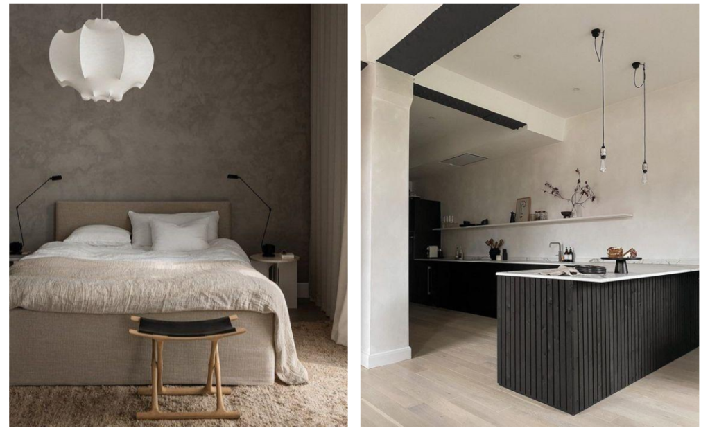
This simple, durable, and honest palette is a personal favourite, with low-density, ultra-matte
colours that feel deeply tactile. Creamy white lifts the scheme, while muted greens, browns,
and reds bring an organic yet modern, slightly earthy quality—creating interiors that feel
wholesome, comfortable, and refined.
How to use it:
These tinted neutrals work beautifully in any room, bringing a calm, balanced feel throughout the home.
Enhance their depth with textured wall finishes like limewash, and layer in tactile materials such as hemp,
linen, and wool for a warm, inviting atmosphere.
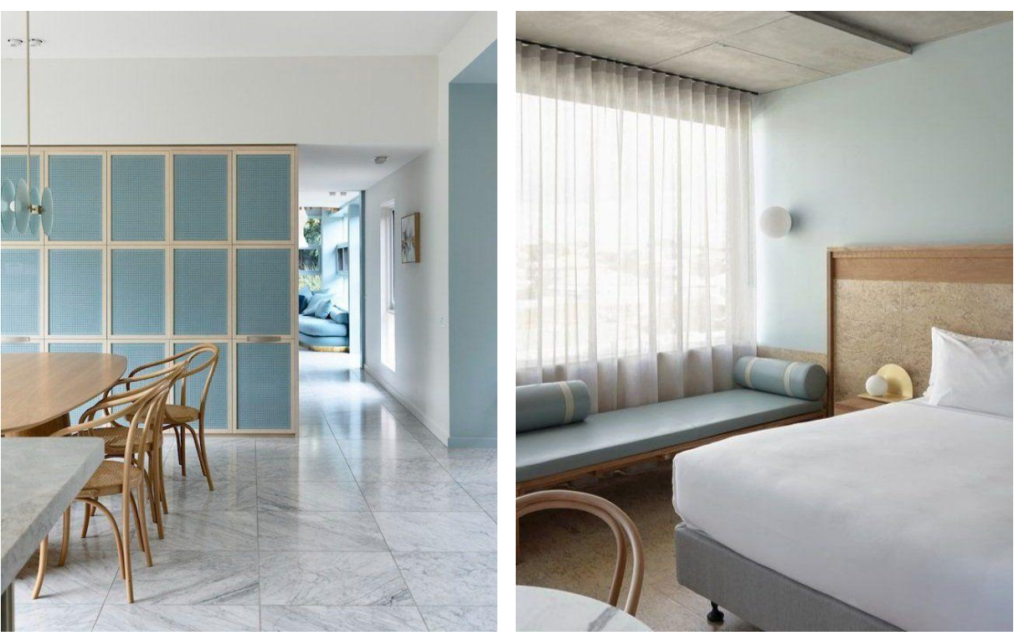
This fresh, youthful palette blends softened blues and greens to create a look that feels
optimistic yet calm. Inspired by the sea and sky, blues bring relaxation, while greens evoke
growth and renewal. Paired with organic browns, greys, and a crisp cool white, the
result is a clean, balanced, and naturally harmonious space.
How to use it:
Use blue or green as a base for statement walls or upholstery. Add a youthful touch with geometric patterns,
and balance it with natural materials like wood, cork, and stone for an organic feel.
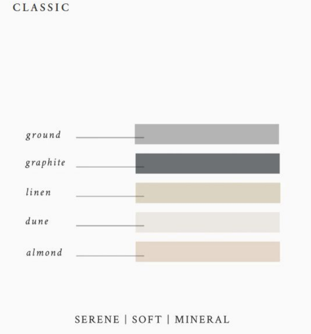
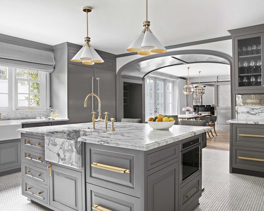
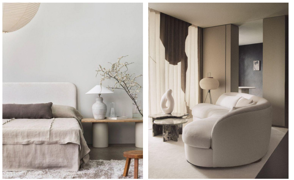
This sophisticated palette combines airy, feminine neutrals with deeper, grounding greys,
balancing Yin and Yang for a harmonious,well-rounded feel. A safe choice for beginners,
warm beiges create a calm, classic backdrop for pause and contemplation, while stronger
accents add depth and prevent the space from feeling dull.
How to use it:
Use any shade freely—these neutrals are designed to work together effortlessly. Choose lighter tones for walls to keep the
space airy, and add darker accents through cushions or linens. Reverse the balance for a cozier, more enveloping feel.
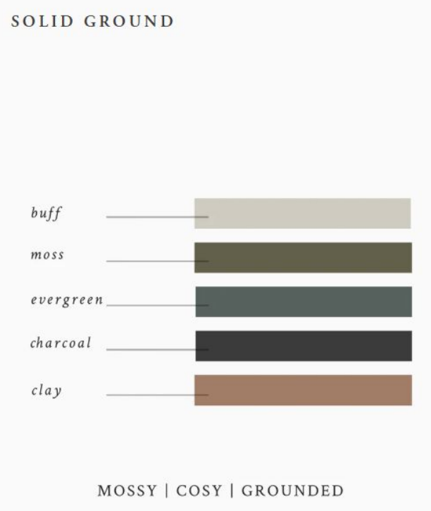
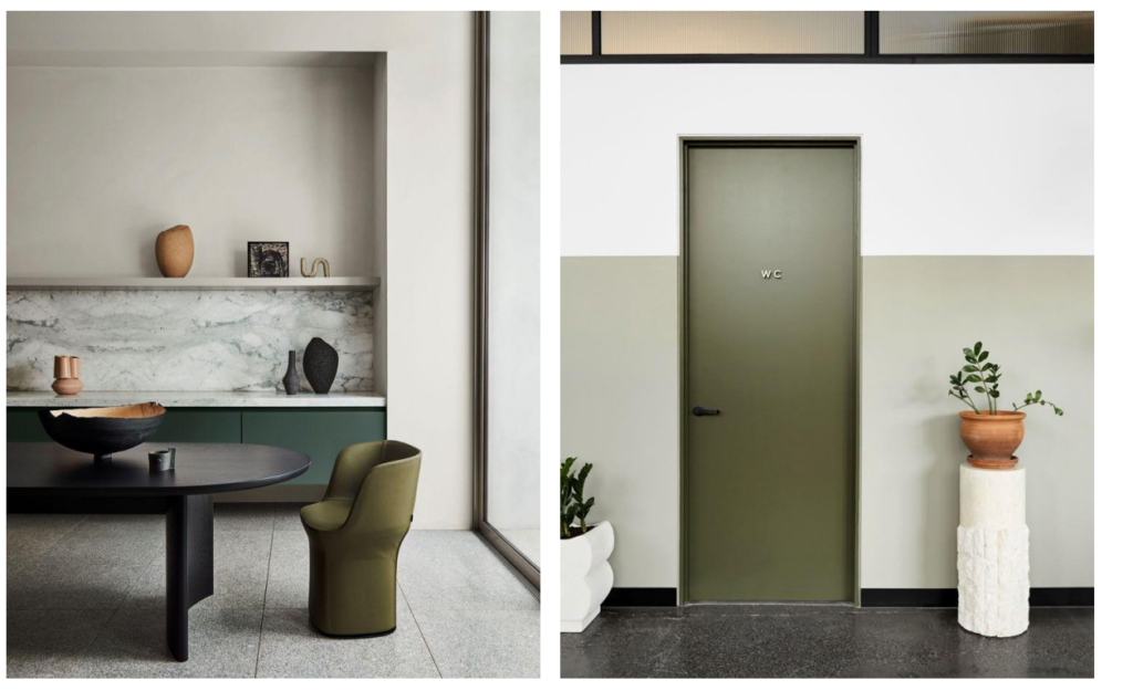
This green-focused palette has a grounding, reassuring quality. Green, often associated with
growth, wealth, and abundance—both in nature and in a financial sense—brings a feeling of
stability. Deeper greens add richness and depth, enhanced by matte, textured black, while
earthy tones like grey stoneware and red clay create subtle contrast, adding warmth and light
to this cozy, balanced scheme.
How to use it:
Apply mossy greens to lower walls or kitchen cabinets to enhance the grounded feel. For a bolder look, use textured
finishes like limewash on full walls. Add warmth with terracotta pots or wooden accessories as subtle, earthy accents.